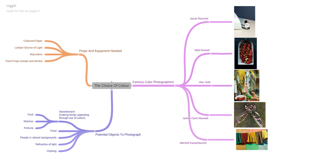
The Choice Of Colour
Project Introduction
I have chosen to study colour photography as colour is one the most critical components in a photograph - a shot could be perfectly framed using positional techniques, such as the rule of thirds ect, but if the composition of colour is not balanced, it wont display the atmosphere the photographer intended. Colour is often a tool utilised in marketing specifically to make a product a company is trying to sell more desirable, as colour resonates with people on an emotional level in a way that words and other things simply cannot. For example, red is an extremely vibrant and standout colour, often being associated with anger and fire or warmth, and is quite eye-catching while among other colours whereas green has connotations of health and is quite a soothing colour, purposefully being used by grocers when selling fruit and vegetables to create the idea that it is quite fresh. A demonstration of the power colour holds is that, when selling fresh produce, browns are typically avoided as it connotes to rotting and overripe vegetables, which would put consumers off. I hope to also use colour in this way and perhaps have a shoot where I also use it to produce a set of advertisment-type photos with products of my choosing.
Photographers I will study and research in order to gain some insight into colour photography may be Jacob | Reichel, Matt Russell, Alec Soth and others. One photographer that has already caught my eye already is Matt Russell, and his website displays a range of styles but his use of colour in his culinary photography is what I really admire, as the photos of food like pasta, fruit and fish are extremely effective as dish often uses complimentary colours like a spicy red fish with green garnishing. The Jacob | Reischel website was also extremely interesting at a first glance as their techniques and their selection of sophisticated and elegant colours on their palette such as blacks, silvers, greys ect.
Initially I wanted to study the Choice of Colour in order to be able to both work on this project while in school and in my free time, as I didn't wish to limit the amount of work I can put in. To conclude this project, I am aiming to have a final gallery of my best photos and another set of photos organised and shot to almost appear as an advert, due to the pivotal role colour plays in influencing consumers. I also aim to develop my camera skills even further that I did in my last project, with my goal as being able to co-ordinate and carry out a shoot independently without the help of others, and to be able to maintain a high standard of photo by keeping track of my camera settings and adapting them to changes in the surroundings. I aim to include mostly raw or slightly edited photos in my gallery to add some variety as my Portrait project is dominated by edits, whereas I don't feel that heavy editing is required to demonstrate the significance of colour.
Project Mind Map
(Colour) Product Photography
Analysis 1

Photographers interview - https://neubau-eyewear.com/blog/frame-minds-artists-month-jacob-reischel
CONTEXT
Jacob | Reischel is actually a team of two German photographers, Julia Strathmann (Reischel) and Marie Jacob, with their signature name being derived from their surnames. They both studied Industrial Design at the Berlin University of Arts, which would give them insight into the processes and reasons behind the mass produced products used across the planet. This is evident in their work, as they are extremely effective at manipulating colour, shadows and positional techniques to, almost advertise products in their shots, as these techniques make them seem extremely desirable. On their insights on the Neubau Website (link above), they say that they're starting to expand into a " whole new area of crisp, sleek, smart originality", one that both "sells and inspires", demonstrating their commercial intentions, with the pair having done collaborations with companies like Mont Blanc, Hyundai etc.
CONTENT
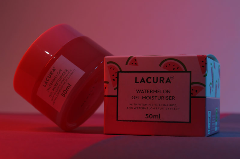
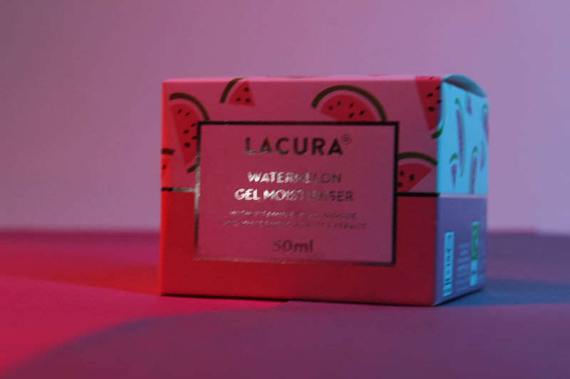
In this photo that was taken from their website, what may be a facewash is visible beside a halved lemon and what appears to be a dropper bottle, typically used for things like essential oils. Jacob Reischel has been known to work for magazines and this is very reminiscent of something found as an advertisement or inside a beauty magazine, as the product displayed is a facewash and this looks like a skincare advert. The product placement has evidently been thoroughly thought about, as the positioning of the lemon and bottle are extremely interesting - the lemon slice could be seen as if its being balanced between and slightly under the two coloured turquoise and green-ish paper sheets. Alternatively, the lemon could have been sliced strategically used instead to do this. The facewash bottle writes, "detox your life" : the colours used further reflect this message as blues often resonate a tranquil but stable atmosphere, and green being associated with freshness and health. The bottle name appears to be "gegengift", which means antidote in German - antidotes are used in order to treat someone who may have been exposed to a poison or chemical.
COMPOSITION
The duo have intentionally not used an infinity curve with the coloured paper in the background, instead separating the corner into a light green and a turquoise section. They have also positioned whatever lighting equipment they used on the far right from the camera, casting quite a long shadow behind the bottle onto the green and almost creating and adding a new hue of green and blue into the photo using the paper backdrops, creating quite a chromatic effect as multiple hues of the same colour have been used subtly but elegantly. The lemon also lies on a sweet spot, and this combined with the vivid yellow makes the lemon one of the things the viewer notices almost immediately. There is a slight streak of reflection on the dropper bottle , further adding another slice of colour. The manner in which the bottle has been situated, almost hanging off of the corner, causing the viewer to notice the two main separate hues used - the distinct disconnection of two colours creates a diagonal line going across the photo and subtly using the rule of thirds. Not only that but the photo is only composed of 3 objects, a use of the rule of odds, adding a sense of balance due to the fact things in nature usually come in threes, further illustrating the freshness of the facewash.
COMMENT
I really like this photo as it adds a novelty and vigor to the facecare product through its use of colour, which appeals to me and imagine it would appeal to potential customers very well, as the chromatic effect makes it very satisfying to look at. In terms of weaknesses, I can't really pick one that would make sense as its of extremely high standard due to being taken by two highly skilled and trained photographers. For future shoots I hope to magpie their use of two different hues of green in product shoots to also be able to make a product desirable, and for this the skills I require would be most obviously my choice of colour, but also my composition as the rule of thirds, postioning of lines ect could also further make a photo more effective.
Jacob | Reischel is actually a team of two German photographers, Julia Strathmann (Reischel) and Marie Jacob, with their signature name being derived from their surnames. They both studied Industrial Design at the Berlin University of Arts, which would give them insight into the processes and reasons behind the mass produced products used across the planet. This is evident in their work, as they are extremely effective at manipulating colour, shadows and positional techniques to, almost advertise products in their shots, as these techniques make them seem extremely desirable. On their insights on the Neubau Website (link above), they say that they're starting to expand into a " whole new area of crisp, sleek, smart originality", one that both "sells and inspires", demonstrating their commercial intentions, with the pair having done collaborations with companies like Mont Blanc, Hyundai etc.
CONTENT
In this photo that was taken from their website, what may be a facewash is visible beside a halved lemon and what appears to be a dropper bottle, typically used for things like essential oils. Jacob Reischel has been known to work for magazines and this is very reminiscent of something found as an advertisement or inside a beauty magazine, as the product displayed is a facewash and this looks like a skincare advert. The product placement has evidently been thoroughly thought about, as the positioning of the lemon and bottle are extremely interesting - the lemon slice could be seen as if its being balanced between and slightly under the two coloured turquoise and green-ish paper sheets. Alternatively, the lemon could have been sliced strategically used instead to do this. The facewash bottle writes, "detox your life" : the colours used further reflect this message as blues often resonate a tranquil but stable atmosphere, and green being associated with freshness and health. The bottle name appears to be "gegengift", which means antidote in German - antidotes are used in order to treat someone who may have been exposed to a poison or chemical.
COMPOSITION
The duo have intentionally not used an infinity curve with the coloured paper in the background, instead separating the corner into a light green and a turquoise section. They have also positioned whatever lighting equipment they used on the far right from the camera, casting quite a long shadow behind the bottle onto the green and almost creating and adding a new hue of green and blue into the photo using the paper backdrops, creating quite a chromatic effect as multiple hues of the same colour have been used subtly but elegantly. The lemon also lies on a sweet spot, and this combined with the vivid yellow makes the lemon one of the things the viewer notices almost immediately. There is a slight streak of reflection on the dropper bottle , further adding another slice of colour. The manner in which the bottle has been situated, almost hanging off of the corner, causing the viewer to notice the two main separate hues used - the distinct disconnection of two colours creates a diagonal line going across the photo and subtly using the rule of thirds. Not only that but the photo is only composed of 3 objects, a use of the rule of odds, adding a sense of balance due to the fact things in nature usually come in threes, further illustrating the freshness of the facewash.
COMMENT
I really like this photo as it adds a novelty and vigor to the facecare product through its use of colour, which appeals to me and imagine it would appeal to potential customers very well, as the chromatic effect makes it very satisfying to look at. In terms of weaknesses, I can't really pick one that would make sense as its of extremely high standard due to being taken by two highly skilled and trained photographers. For future shoots I hope to magpie their use of two different hues of green in product shoots to also be able to make a product desirable, and for this the skills I require would be most obviously my choice of colour, but also my composition as the rule of thirds, postioning of lines ect could also further make a photo more effective.
"Jakob | Reischel" Moodboard


Shoot Plan 1
For this shoot I plan to shoot in the PEXA theatre after school, and I have ordered a backdrop frame in order to create a white infinity curve in order to add a sleekness to my photos, and I have also ordered 3 lights with coloured gel accessories to apply onto them, and these will add a coloured light effect - I am planning to make one light a similar colour to the creams and facecare products I am shooting, and another a complimentary colour (a colour opposite to it on the colour wheel) to it, for example a red coloured cream with a red light and accents from the blue light. I will be using a Canon DSLR for this, and due to to this being a quite close range shoot in comparison to my last one, I will be using camera settings to suit this, such as ...... . My teacher will be bringing a range of different facecare products for me similar to the ones that I have analysed and studied from Jacob | Reischel, and these will be my subjects.
Facecare Shoot


Best Image
This is the best shot of the shoot due to the quality of it - I have used a moderately low aperture, such as F5,6 due to the slight noise that is created in the background. The line seperating the red and blue paper creates a leading line across the image which draws the viewers eyes across the photo quite effectively. I have intentionally used both red and blue as they two colours that contrast each other quite a lot, and I even used a blue gel on one of the lamps in order to add a tinge of blue light which I placed onto the right hand side of the moisturiser box.
|
Worst Image
I dislike this photo quite a lot as it is quite noisy but not where I intended, as my subject has also become noisy - this may be due to either a slow shutter speed such as 1/2 combined with a shaky hand, or due to a high ISO such as 3200 or a low aperture such as F2. Furthermore, the composition is quite poor as I must have slightly brought my hand down when I took the shoot as there is too much of the tabletop that I was shooting on showing, and I was instead going for the use of the rule of thirds, but that is not being used here.
|


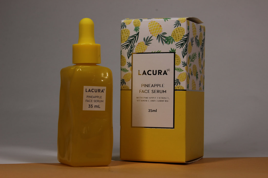
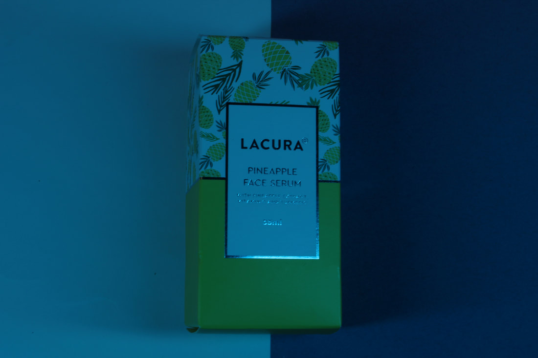
Best PhotoThis photo is my favourite as it is composed quite well ; the strip of yellow intersecting the serum bottle and box diagonally creates a leading line that draws the viewers eyes across and onto the subject. The green in the leaves of the pineapple on the serum box, for me, cuts through and makes the photo not be overbearingly yellow. The yellow suggests......
|
Worst PhotoThe main reason this is my least favourite photo is the fact that I dislike the angle of the shot, as it makes the box look quite uneven and disproportionate, whereas the line separating the two blue colours is directly down the middle but the box isn't as straight, which to me looks quite off-putting. To add, the blue gelled light i used o for this section of the shoot makes the photo look quite dark and eerie, which is something you wouldn't want if you were trying to advertise something.
|
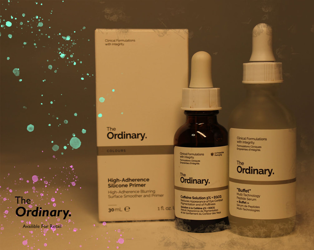
Edit 1 : The Ordinary. Marketing
Unedited Photo
Unedited Photo


(Colour) Musical Photography
Analysis 2

CONTEXT
Ilona Gerasymova is a concert and music photographer from the capital of the Czech Republic, Prague. Her photos often fixate on capturing the intense emotion present at concerts through her manipulation of colour and composition, and although Gerasymova works for clients, as on her website she has left her prices and contact details for shoots, I am unable to locate who this shoot was for, although I can assume it is a rock band of some sort due to the instruments and the atmosphere the photo presents.
CONTENT
This photo excellently captures the pyrotechnic special effects used at this particular concert, with the orange of the flame and the blue of the stage lighting complimenting each other due to being opposites on the colour wheel, but the stage lights are also party orange but these are visibly smaller than the blue ones. The lights are also angles due to them moving from wide to thin, which gives the photo a sense of perspective that is lost due to the crowd, almost reminding me of looking down a long corridor. The lights having sharp lines that demonstrate the specific direction they're pointing in, which creates leading lines that lead the viewers eyes across the image from the lights to the musicians, and then to the crowd. The stage, chairs in the stands that remain empty during concerts in order for sound to reverberate well, and the heads of the people of the crowd compose a sense of a fore, middle and background ; this may be due to the stands on either side of the stage being visibly further away, and the difference in head sizes of those closer to the camera in comparison to those near the stage.
COMPOSITION
The image of the artist on the two screens either side of the stage combined with the artist themselves on the stage creates a rule of odds, making the photo feel and look quite natural, as a lot of things in nature come in odd numbers, such as a 3 leaf clover. The three rectangular lights above the stage also adds to this effect, but they also create leading lines across the top of the stage that draws the viewers eyes to each side of the shot - each strip appears to be shorter than the one above it, either due to the fact that they actually are, or that the top one is closest to the camera. In terms of camera settings, I believe Gerasymova would have used a quite large F-Stop as the depth of field is quite deep, and for a concert, your aim is usually to not blur out any aspects of it. The ISO looks as it around 400 as no parts of the photo are visibly grainy nor have any noise. For any shoot in which you're taking photos of fast paced subjects, the shutter speed should be quite quick, and due to the lack of motion blur from any of the concert attendees or artists, it would have been at around 1/200th of a second, as if it was too short then not enough light would reach the lens and the shot would be extremely dark. The repeated light strips and the people looking scaled differently makes the stage seem quite far away from the camera, and I suspect this is a product of the use of a 0.5x lens, which I can also use from my iPhone 11 camera. I really like how this photo has been framed as its extremely symetrical its dark on the outside, then becomes lighter towards the centre, which almost creates a natural frame for the shot that draws your eyes towards the middle.
COMMENT
I quite like this photograph as it has been composed well in order to seem pleasing to a viewer, and the colours captured are quite intense and emotive, which is what I believe this intending to portray. I hope to also achieve this effect as I also have tickets for a show at the Manchester AO Arena, for a UK artist called Santan Dave ; however I doubt I will be able to take photos as effective as hers as some of her shots are from points of view that I do not have the authority to take photos from, such as on the stage. The only thing I would change about this photo is the fact that the positioning, as there is slightly more black border/background on the left than on the right, howver I am just nitpicking and is only noticable once pointed out, and this can be remedied with a simple touch up on photoshop.
Ilona Gerasymova Moodboard


Shoot Plan 2
As this shoot will be outside of school, I am going to a concert with my model present, Santan Dave. For this, I will have to position myself in the Manchester AO Arena accordingly in order to take some high quality photos with use of compositional techniques such as the rule of thirds ect... I am relying on the arena lighting and equipment to be able to capture how effective colour is in expressing or triggering emotion in the viewer, especially when paired with music - although, by viewing other shows that my model has held, I am aware of the incredible scenery that he puts on sometimes on stage, so my aim will be to photograph this. The camera I will be using is a Canon DSLR, and I will have minimal if not any equipment other than that due to the fact that I will be standing in a massive crowd. Camera settings that will be ideal for this environment
Concert Shoot


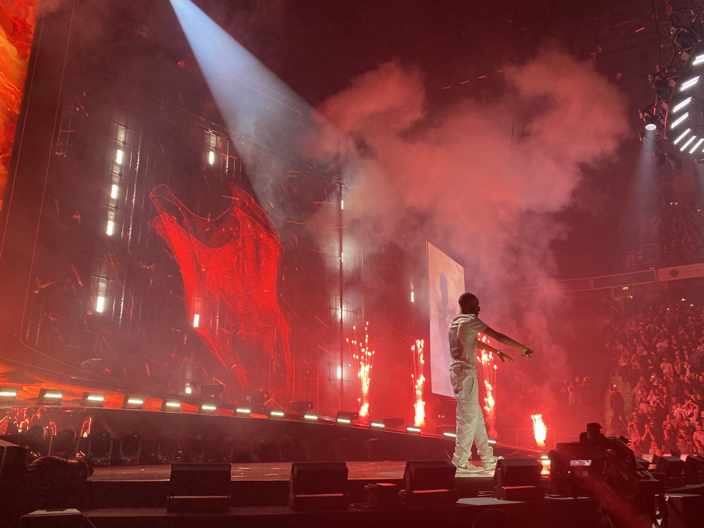
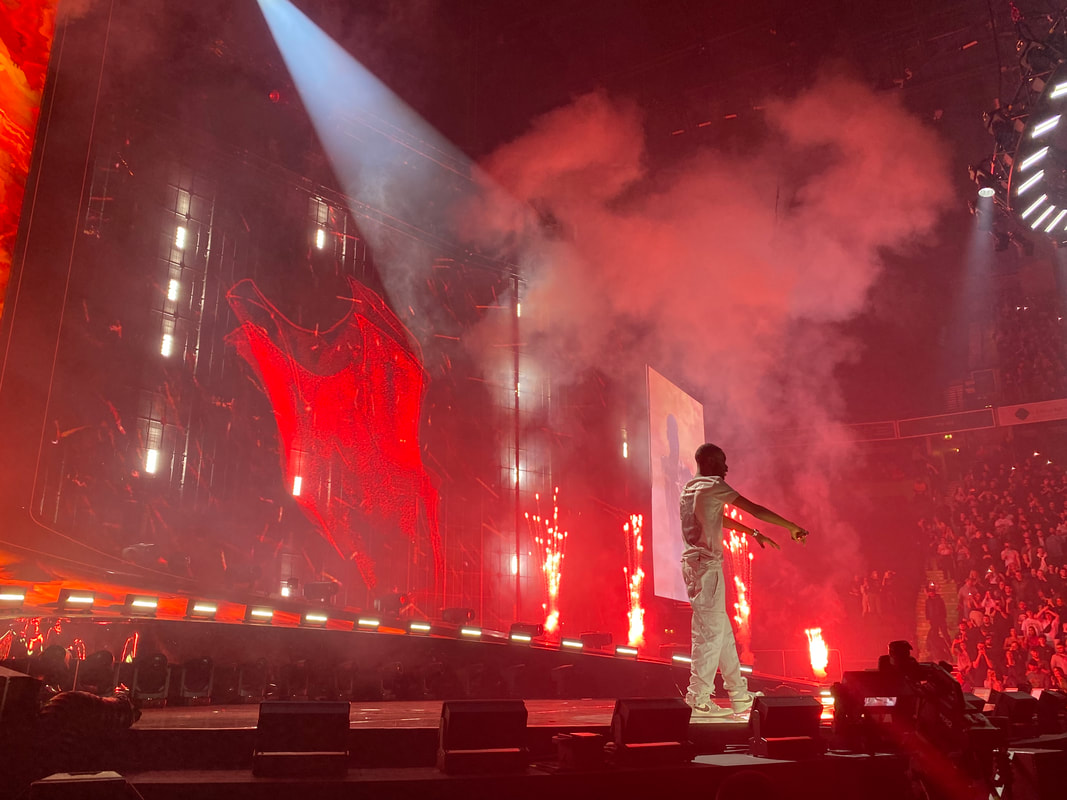
Best ImageThis photo for me is just by far my favourite as it is strong in all areas. Its composition is exeptional, as it manages to capture the full stage and my model without any security guards or concert goers under it, which was a large issue during this shoot. It also doesnt feel lonely as the right hand side of the photo captures a small segment of the crowd, making it feel as if it is the best of both worlds. The red lighting and fire, which is usually done by releasing lithium ions during combustion, adds a warm, intense and vehement feeling, which reproduces the feeling of the song being played quite well.
|
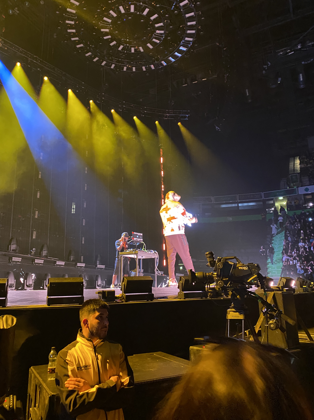
Worst ImageThis was actually not a photo of my planned model, Santan Dave, but rather another smaller artist called Meekz Manny who was brought along by Dave to also peform on his tour of the UK. Due to being a smaller artist, not as many pyrotechnic and special effects were being used for his peformance as it wasnt the main event, so the use of colour in this is quite weak. It also has quite weak composition as it has captures the security guard which I didnt wish to, and my model is quite blurry which indicates the use of a shutter speed that is too high.
|
1st Edit (Mock)
Original Photos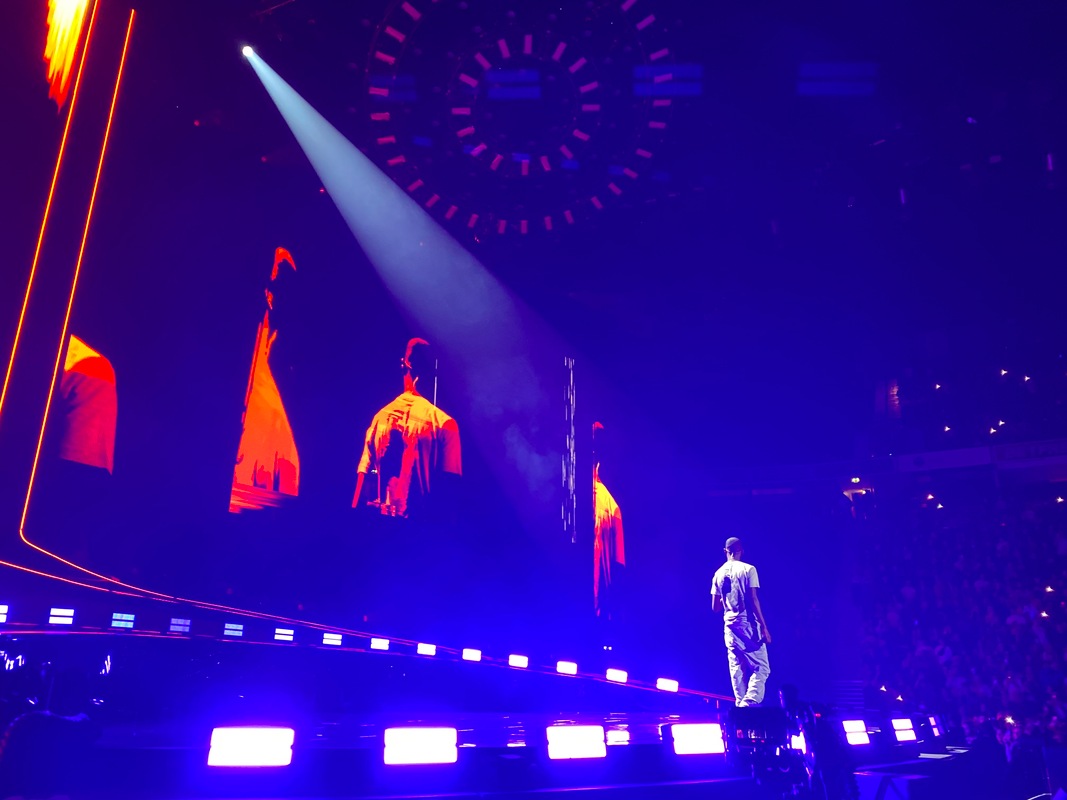
+ =
|
Edited Photos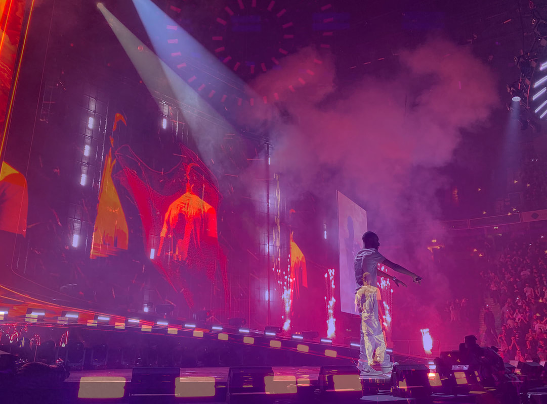
|
Editing Process


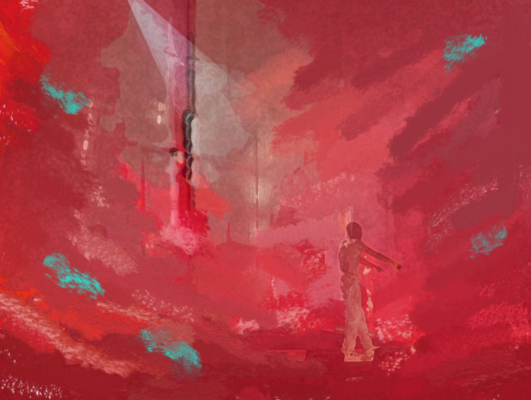
I chose to do a sort of overlay effect with these two photos as they both showed very impressive uses of colour, such as the red flames and lighting that were used, and I believe those lights were used during a quite passionate song, as red is a quite intense and warming colour : not only that but blue is quite cold and sad colour. Overlaying the blue photo with the red was quite interesting as it made the photo majorly purple as I anticipated but it kept the silhouette of my model, which I chose to place behind the silhouette from the base photo. I then changed the opacity to around 65% in order to intentionally remove some subjects and the colour. The purple that resulted from the laying is was a purple hue which is often associated with spirituality and mystery, but also royalty. This edit may be in my final gallery, but seeing as I hope to improve my editing even more throughout this project, I may prefer to put a raw photo from this concert shoot in my final gallery as some of them are extremely clean and high definition.
Album Cover Edit
Edited Image

Original Image
Editing Process :


Editing Process
I started out by adding a sort of water colour paint effect onto a photo by watching a tutorial on Youtube of how to, but i noticed that this removed almost all of the detail in the photo, so I added a "Sponge" effect under the "Artistic" section of photoshops Filter Gallery as it gave it an artistic effect without making my model indistinguishable, but this still lacked the artistic feel I was going for, as the album cover has a paintbrush stroke effect. To achieve this, I used the "Smudge Tool" and pointed my "brush strokes" to converge on my model. This gave me the desired effect but I decided to add small strokes of turquoise and blend those in too in order to add some variation and balance as it felt too red beforehand. The final product is one of my favorites from this project and will definitely be in my final gallery
Edit Tutorial
Inspiration for Edit

I took inspiration for the art style and colour scheme for this edit from the album cover of Santan Dave's new album, "We're All Alone In This Together".
Adding Details (Album Covers) Using Canva


Best Album Cover Version
It was quite difficult to decide which version of the cover, but the one I chose, purely down to personal preference, was this one as it appeared the cleanest and most satisfying to look at due to the logos and the border matching - I wasn't able to get a white parental advisory sticker otherwise I would have done a version with that one also. I made this on Canva, using a preset. I firstly removed the stock photo and dragged my own photo on, then positioned it to determine which parts were going to be in the cover as it needs to be a square. I then deleted any unnecessary elements from this and added the black border using thin rectangles and added in my title using the font on the preset, which I chose due to being similar to the one on the original album cover. I wanted to add a parental advisory logo but the original one looked and felt quite tacky and plasticky when next to the paint brush effect, so I found a website which had a spray effect version of the parental advisory sticker, which I added on, adding to the artistic feel I intended to create.
Shoot Plan 2
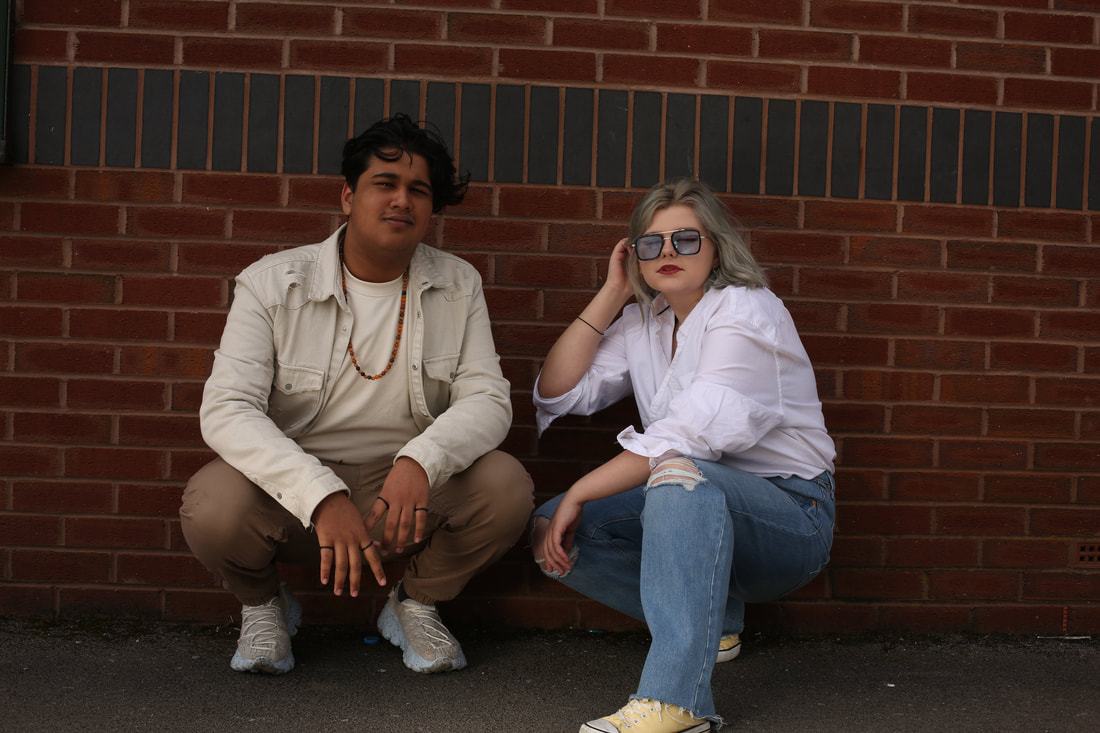
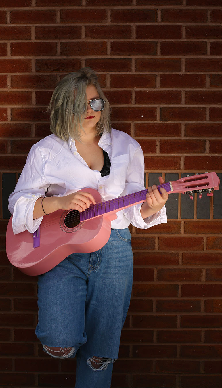
For this shoot, two models Mikaeel and Holly have agreed to come in at a scheduled time during the school Easter holidays to be models for a musically themed shoot, which I will be doing with the assistance of a professional photographer called Justin, who I have worked with before on my portrait project. He will be helping me co-ordinate the shoot but as I am more experienced than the last time I worked with him, I will be more in charge of taking the photos. The camera we will be using is not my regular DSLR, but a Canon x with a 50mm lens, and it will be working along side a flashgun and reflectors that Justin will position towards whatever part of my model I direct him to . The equipment we will be using will be backdrop sheets with a variation of colours to use for it, such as blue and red ; I specifically want to use the blue backdrop to contrast with the pink guitar that one of my models will bring in. I also plan to take some photos outdoors against the red brick walls of the humanities building of our school, as it will give the photos a antique feel that many musical photos have - I also plan to manipulate some natural sunlight through reflectors to give my models a glowed look. From this shoot I am not aiming to make any complicated edits, rather small adjustments to make the colour really amplified but not to the extent at which it looks artificial and plasticky.
Music Themed Shoot
Indoor section*


Best Image
This photo is, in my opinion, the best of this indoor section with Mikaeel, as its positioned and is composed quite well ; the guitar is being held in a quite natural position and the neck going diagonally almost creates a leading line towards my models facial features. It is lit quite well thanks to the flashgun, and it allows the contrasting pinkish and light blue to clash, making this photo quite effective at communicating through its colours.
|
Worst Image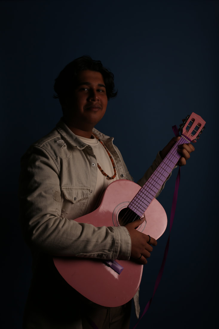
Compositional techniques aren't the issue here, rather it is the lighting in this case that does so, as its very poorly lit. I believe this may have been due to this being one of the very first shots taken in this shoot so I must have adjusted a camera setting, such as the exposure, or the reflectors to have continued.
|
Outdoor section*


|
Best Photo
|


Best Photo
The useage of the reflector to reflect the natural sunlight onto my models sunglasses creates a quite effective shine into the camera,
|
Worst Photo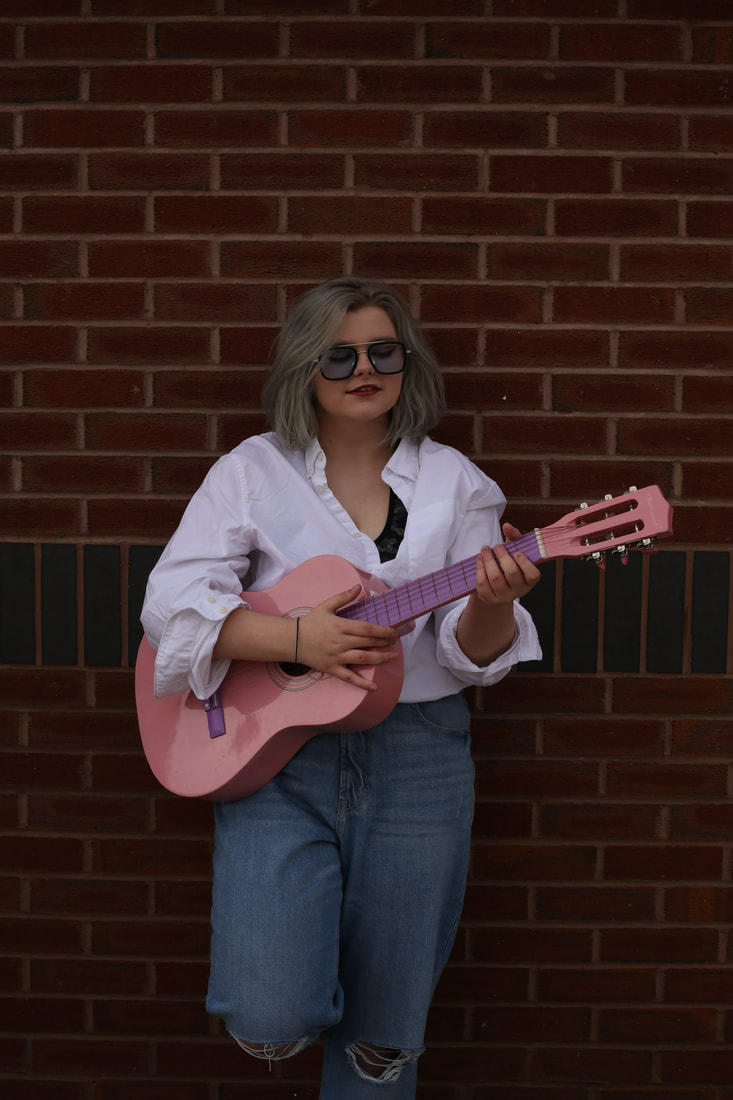
The reason for this photo being worse the most is the fact that this was the very first shot taken outside so camera settings such as aperture, exposure and white balance, such as daylight. In terms of composition, the photo is not very bad but relative to others in this section its the least effective.
|


These photos of my model Holly is a part of my shoot with professional photographer, Justin, which I took as it adds to my culinary section of this project, and I hope to incorporate it in some way. Although due to time constraints and other issues I doubt I will be able to and I will only be able to use these photos to demonstrate my use of colour. The blue background contrasts the warm colours that are in the flowers on Hollys apron.
Edit 1

|

|
For this edit I was aiming to only enhance what the photo already had, so I went to adjusting the composition and ever so slightly changing the colour ; I began my cropping the photo to eliminate the larger left side of the background to make the image seem more symmetrical and to place Hollys body and specifically her face onto a sweet spot, adding a fluidity to the photo. To enhance the colour, I didn't want to adjust the saturation as that makes the photo look quite synthetic, so I decided to play with the vibrancy ; both features saturate the pixels in the photo, however vibrance excludes pixels that are already quite saturated with colour. Using this made the pink of the guitar and the blue of the jeans pop even more. This photo still looks as if its raw and unedited but that was my goal, and this may be going into my final gallery in order to have some raw looking photos in the group.


Editing Process:
(Colour) Culinary Photography
Analysis 3


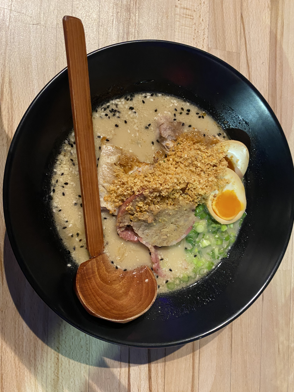
CONTENT
This photo shows two bowls of Japanese ramen noodles, with a side of some green vegetable I don't recognise and chia seeds. It looks quite natural and isn't an idealistic image, such as certain other food photos where it looks too perfect, as this has chia seeds on the table and the greenery on the side has fallen of the plate slightly ; this is effective as it allows the viewer to imagine the meal, as it seems realistic and not plasticky, as some photographers use inedible products to imitate certain problematic aspects of a meal, such as ice which melts, or to improve its appearance, such as adding glue to cheese to increase its pull. The lighting has been used quite well as the shadows on the left of the bowls ..... . The green spring onion and vegetables add a sense of freshness and nature, and this is contrasted by the warmth and energetic orange in the egg yolk and sliced carrot on top.
CONTEXT
This was taken by Beata Lubas, a culinary photographer, but I am currently unable to locate her country of origin, who has won multiple awards and worked for clients such as Waitrose, Quaker Oats, VitaMix ect. On her about me on her portfolio, she states that rather than being passionate about cameras or taking photos, she is passionate about food and the process of making it, saying that it is more than a few ingredients mixed together.
COMPOSITION
This photo uses the rule of evens, as there are two bowls of ramen, two chopsticks on each bowl and two egg halves in each bowls, creating a eerie feeling due to its unnatural look, but the total dish count is 5 and there are 3 sides, and this contrast creates a strange balance between odd and even, which makes the photo less unsettling : in addition, the disorganisation with the seeds and vegetables being placed quite messily also counters the evenness, which allows the viewer to relate and also imagine they're eating the meal, which is something a lot of food photographers do not do due to their food being too perfect and looking quite synthetic. The positioning and direction the of chopsticks creates leading lines that guide the viewers eyes across the photo to the side dishes very uniquely. This shot was taken using a birds eye view from above, what appears to be granite, table, and this
COMMENT
I quite like this shot as it represents the warmness that a bowl of ramen has through its use of colour, and I hope to re-create this effect in my own way in order to create a final product of a quality high enough to be in my final gallery. For an edit, I am thinking of making food packaging of my own, similar to this one >>
Or do one where I take a photo of someone and do an edit to imitate something you would find in a food magazine.
Beata Lubas Moodboard
http://beatalubas.com/


Shoot Plan 3
I would have liked to have said I planned this shoot but it honestly wasn't, I was out for a meal at a ramen restaurant in Northern Quarter in Manchester and took some photos when I remembered I had studied a photo of ramen that Beata Lubas took. This was taken with my iPhone 11 phone camera, not my usual DSLR, and no eqiupment like a lighting rig was used to take it as it was in the middle of a bustling restaurant, but this was my aim as a photographer, to be as flexible as possible in what i can shoot and what I can shoot with. Some of these turned out extremely well, and I aim to add these to my final gallery, but I was unable to take many photos as I typically do as I feared that my bowl was going to become cold.


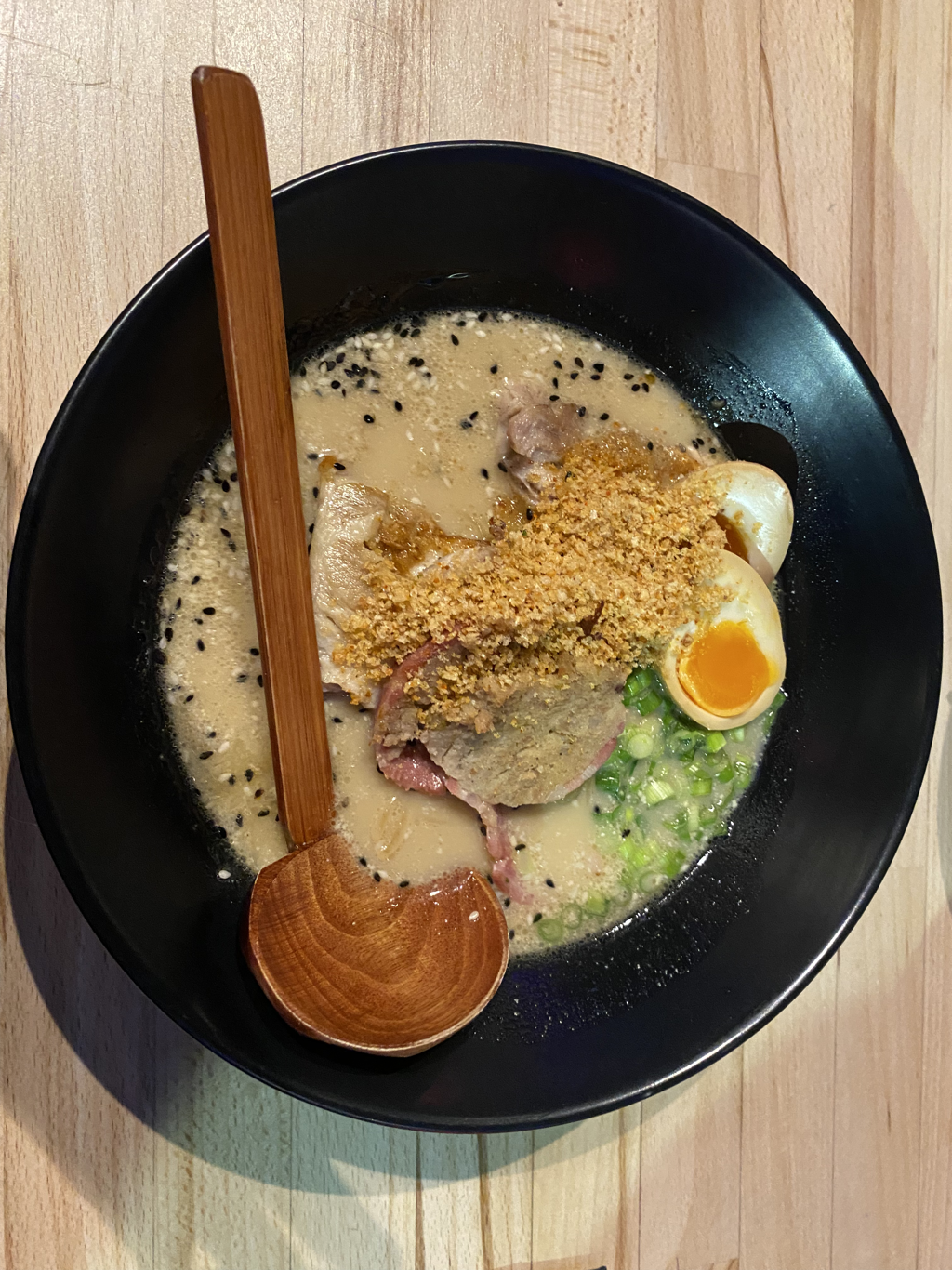
Best ImageThis photo is quite effective due to the balance created by the colours in the ramen bowl. The orange of the yoll, the green of the spring onion, the creamyness of the broth and the elegant black of the bowl all makes it look quite comforting and fresh. It is also composed very well from a top down view which doesnt exclude any aspects from the dish. However one thing I would change is the lighting as shadows are quite prominent, but this gives the photo a sense of relatability to me as it doesnt look too perfect or artificially arranged.
|
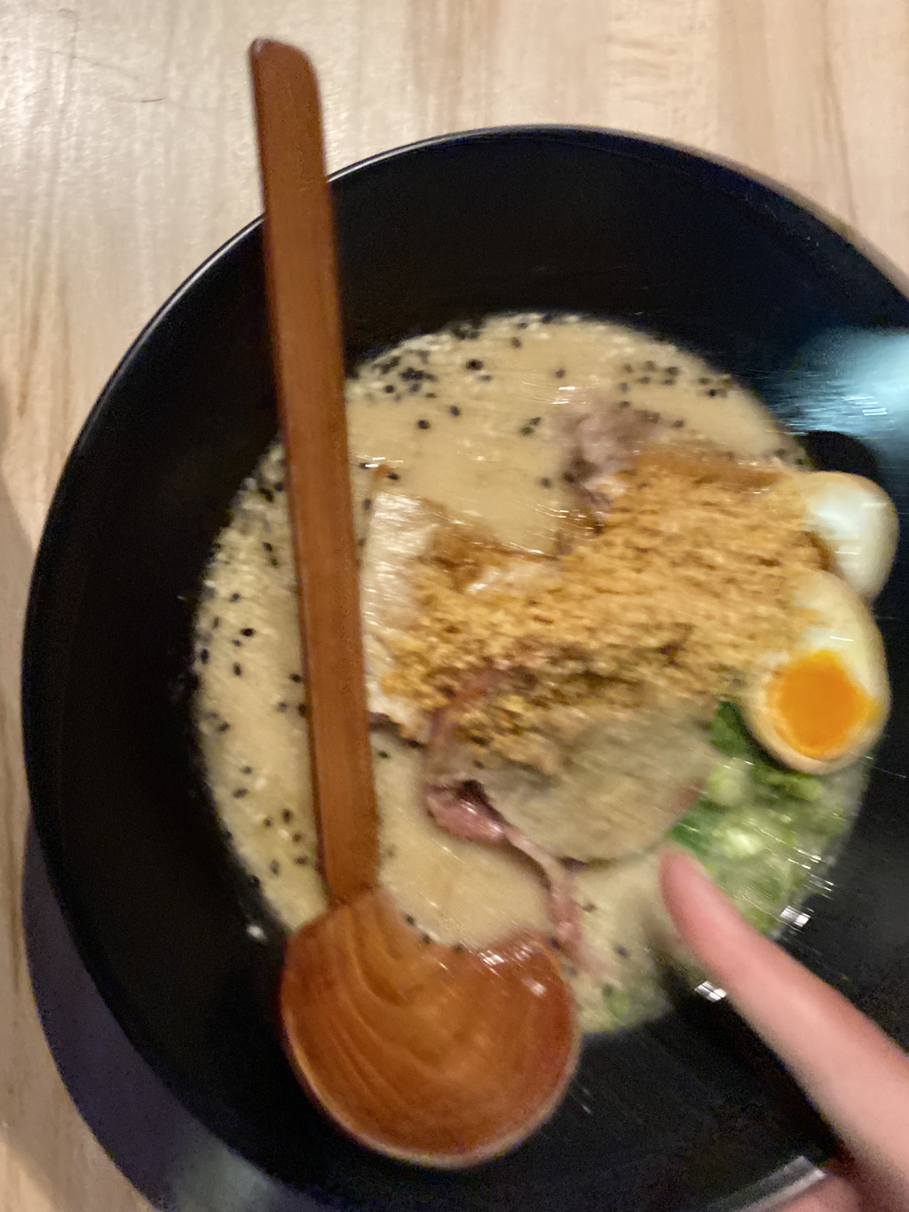
Worst ImageDue to its noisiness and interruption from a pointing finger, I chose this shot from this shoot as the worst as it makes the photo look quite disorganised. As all my other shots are free from noise, I suspect that this was taken during motion which caused the noise. This is supported by the fact that the composition is off as a edge of the bowl is cut off.
|
Shoot Plan 4
For this shoot I plan to take photos of colourful cupcakes to improve my understanding and hopefully boost my grade for this project, which fixates on colour. To do this, I have allocated a Monday after school in the drama hall, to set up a desk with a white backdrop and a Canon DSLR camera, and some light lamps with white light, as with this shoot, I hope to create an outcome that crosses my study of product and food within colour photography. For example, a food packaging label that uses colour to appeal to potential customers would be ideal, and I could also create a social media account that advertises the food and shows the process of the shoot, as a lot of companies do this to engage as many customers as possible due to the infinite reach of the internet.
Cupcake Shoot


Edit 1
(Combining Food and Product Photography)
Inspiration For Edit
|
|
Original Photo
Edited Photo
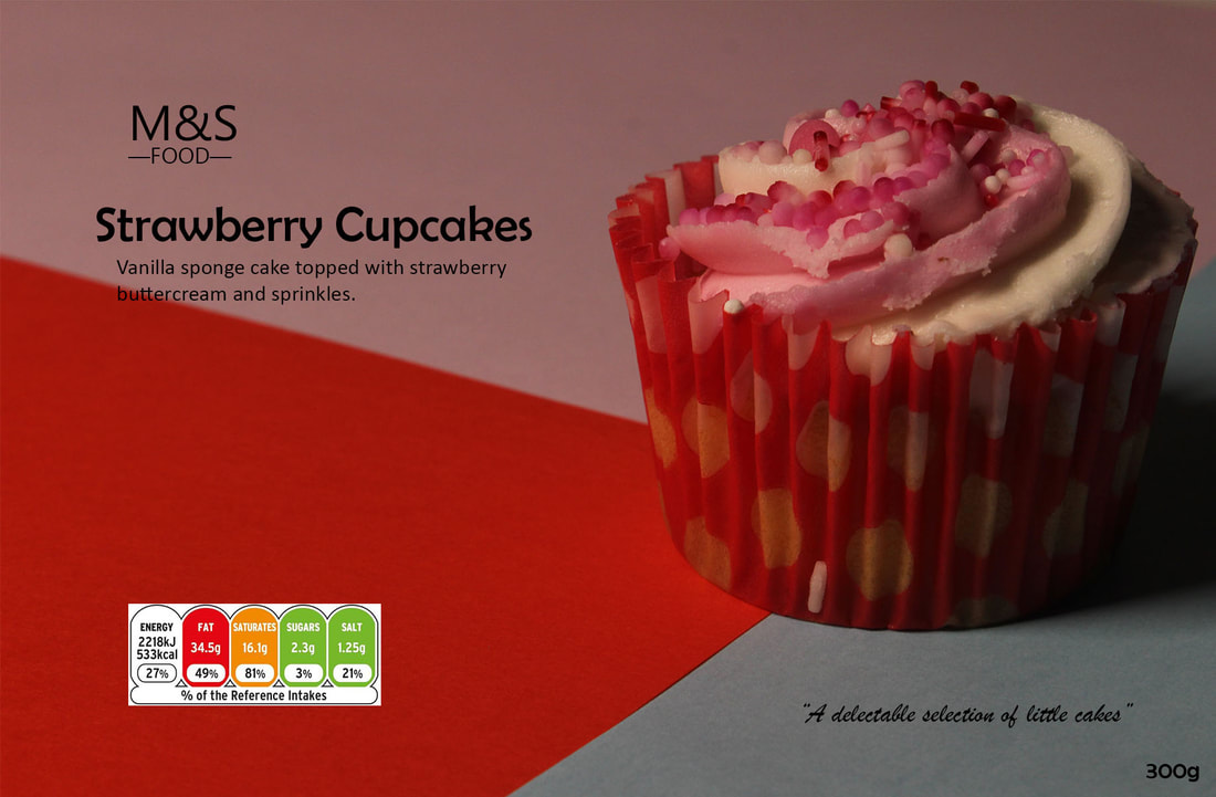
Edit Process


I thought that this photo would be appropriate for use as a base layer to create a food packaging edit from, as its use of colour compliments the cupcake quite well, with the pink going into the red being similar to the cupcake and also creating a quite chromatic effect, and the small area of light blue contrasting as they're opposites on the colour wheel. To elevate this I plan to create a sort of social media campaign or something along those lines using Canva or Tiktok, but I am not exactly sure how I will do it. The only thing I would like to change about this is the food label, as its white border throws off the photo for me, and its nutritional information is very inaccurate for something like a cupcake, which would typically be less fat and more sugar. This combination edit or a variation of it, similar to my work on my portrait project, will most definitely be in my final gallery as it is, in my opinion, very effect in its use of colour.
Final Gallery

Project Conclusion
When I began this project for my coursework I had planned to remain linear and stick to one theme only, but as I continued working, I branched out unintentionally to different segments of photography in which colour is a vital aspect, such as culinary photography (food), musical photography, and product photography. It was fascinating to me to learn how marketing companies manipulate colour in campaigns to make a customer feel a certain way, as colour induces emotion immediately in a way language is unable to. I took some photos of skincare products and my first section of the shoot is extremely effective at also doing this, which is why I plan to include it into my final gallery.
Moreover, I also enjoyed music, and more specifically concert, photography as it is able to capture an experience that you can later live through again through photos. The gig in particular that I attended was quite high standard and the stage was quite high tech, with pyrotechnics (fire effects) and lights that were quite dynamic, matching the rhythm and atmosphere of the song, and I will display one of the videos of the concert that I took below to show how much colour can demonstrate, despite being a still motionless photo. The photographer I studied beforehand was Ilona Gerasymova, who takes photos at concerts for clients that pay her ; the only small issue is the fact that due to this, her shots will variate slightly from mine as her as positions require some level of authority to be at, but my photos are still quite effective in my opinion as I positioned my camera to include the least amount of attendees in them, so the photo doesn't look too busy or crowded whenever that wasn't my intention.
My favourite edit of the project comes from this section, as my album cover edit of the concert photo looks quite artistic and matches the models own most recent album cover quite closely, and the colour inside of it are the reddish orange and the turquoise, which I added to add some balance to the edit, as it looked quite monotonous beforehand. I managed to cross product with food photography in my final edit to make a sort of combined edit, similar to my Portrait project combined edits, and this ties my whole project together and makes it feel cohesive and like a smooth progression, which was my aim after the Covid-19 pandemic interrupted my Portrait project.
