Texture
Project Introduction
My chosen topic is Texture as result of my passion of taking photos of objects with textured faces and surfaces the most, as the smallest changes in lighting and angles at which the photo has been captured has the ability to change the whole way in which we view it , creating a wholly unique atmosphere, altering the feeling of an image. We also aren’t able to really go out due to the COVID-19 pandemic. To create my own style to shoot and make edits, I intend to research photographers renowned for photos with textured objects to try and incorporate their style into mine ; Lucy Shires, with her signature old architecture and man made textures such as rusty, chipped and corroded walls - and Roe Etherige, as I admire his work on natural textures such as plants and animals.
Ethrige utilises a smaller opening in the lens eg: a f-stops such as 1.8, 2.8 or 4 to create a shallower depth of field to create an out of focus background, emphasising the focal points and drawing the viewers eyes towards something Ethrige wants you to look at, which is a skill that I want to incorporate into my own pictures. As Ethrige takes photos in a studio, I'm going to try and use lamps and other light sources whenever shooting indoors, and position them within the room strategically to mimic his lighting style, meaning I will have to employ a fluorescent white balance, but the daylight setting whenever shooting outside with little to no cloud cover.
Other types of photo shoots and edits which I intend to do are seashells with a significantly lessened saturation and brightness, but not so much so that our subject (the shell) isn't distinguishable, as this is a style that Edward Western is renowned for. I can edit my photos and add a high contrast to add a vibrant tinge to my images, something that Roe Etherige evidently does, but I don't expect much editing to be needed as texture photography is quite minimal, with only small enhancements being implemented to achieve the most aesthetically pleasing final pieces.
I hope to learn more about using lighting and a lack of lighting to create a feeling in the viewer, either to create a quite melancholy or gleeful atmosphere in my man-made or natural texture photos. Throughout this project I am hoping to further develop my camera skills, as it is only my first project, and I aim to do this so that I can minimize the volume of editing I am going to have to do in the end for my final pieces.
I see my final format as being a collage of both naturally clean and modified photos to be printed out, as I personally believe that for a style of photography such as texture, a naturally impressive picture will always be superior to one that requires a lot of modification, however I will also create edits to both diversity my images and demonstrate that I am able to do so.
Topic Mind Map

Analysis 1

Content:
The photographer has taken an image of two apples, one partially sliced up and the other one slightly behind it. I would say it is an image of still life as there are wasps eating the sliced up apple. It is evident that the photographer has used a narrow depth of field, or a low aperture, to make the background out of focus and have what's on the table be in focus. The title is in French, and it is called C’est Pas Du Luxe, which roughly translates to having too much, so much that it is wasted. In my opinion, the writer has used this photo to show how consumer driven our world is nowadays, and I believe that he's specifically talking about the abundance of food we have and, if the wasps ate it all, the wasp would in a sense eat itself to death, kind of portraying today society and how much some of us have that we cant even use all of it, and how other less fortunate people don't even have enough to satisfy their hunger, or to even survive ; this anti-capitalistic meaning that can be derived from this photo could be demontrating the photographers own personal views on society today.
Context:
This photo was first published in his book Le Luxe in 2012, and was taken by Roe Ethridge, and in my opinion, I think it was taken in a forest or garden of some sort, or at the very least a place with greenery and bushes, as we can see this in the background behind the apples. Roe is an American photographer, born in Miami and raised in Atlanta, Georgia ; upon getting his Bachelors in Fine Arts in 1995, he moved to New York City two years after, where his career really took off, starting work for magazines like The New York Times, Vice, Allure ect... His work is described as "using the real to suggest - or disrupt - the ideal. During this time, while reflecting on his project for Allure , he came to the realisation that one of the outtakes from one of their beauty editorials was superior to anything he made intentionally. After this revelation, his signature style of commercial photography, with humourous yet cynical aspects to it.
Composition:
I believe that the rule of thirds has not been used, instead symmetry has been applied, as the table cuts nicely right through the centre of the image horizontally. To add, it is evident that a studio light of some sort has been used, as we can see the reflection in the skin of the apple. But I believe that some natural lighting has been used as you can see a shadow corresponding to the light in the background and it is evident that a narrow depth of field has been used to blur out the background a little bit. My eyes are immediately led to the apple and the wasps on the chopped up bits eating it, and this has intentionally been done by using two contrasting colours : the sharp almost crimson red of the apple and the dark and dull grey green of the shrubbery in the background, making each other seem more vibrant and alive, which is the effect caused when colours that are opposite each other on the colour wheel are implemented together. The shutter speed must be quite fast as it has captured a very short / clear movement of a wasp, a very fast insect as they are able to move at astonishing speeds of up to 20 miles per hour : the clarity of the shot could be a result of the use of a tripod combined with a shutter speed of around 1/500th of a second. There are 2 apples, with 4 cubes of apple sliced on the table and 6 wasps on there, which suggests the use of the rule of evens : this creates a tension as things in nature usually don't come in even numbers, and even in food photo/videography, they always try to avoid even quantities of food, as the composition appears much more satisfying with this, and this rule of evens being used is making the image seem quite eerie and uncanny.
Comment:
Very interesting work, uses complimentary colours for them to clash and contrast, drawings viewers eyes to these points, and insects to draw the viewer to a focal point of the photograph it has some varying interpretations in terms of what it means and represents, and why he's taken this photograph. I am also going to take some natural photographs, with greenery and hopefully if possible also insects to spin my own take on a photo like this. Capturing the complex and intricate textures of fruit such of tomatoes, kiwi etc, at relatively close ranges could also be an avenue I can take.
Analysis 2

Content:
This photo was taken by Lucy Shires, although I am not aware where it was published ; Lucy is famous for her urban abstractions, specifically photos of very antique and worn down surfaces. Here she has taken an image of a very old uncared for wall, in which the paint has almost completely fallen off. In my opinion, it may be a demonstration of the state of the world and what happen if what will happen to our planet if we continue without levels of pollution, both with plastic and greenhouse, and if we continue neglecting the earth, it will start to look something like this wall, just on a colossal scale and much more fatal scale, which could inspire her even more to take these photographs. Also has a very blue / grey theme to her images. The photos also have quite a blueish green / turquoise look to them, also using close ups to amplify texture in her images, something I can do in my images.
Composition:
The rule of symmetry has been implemented in which the face of the wall is equally distanced from the camera on both sides. The curved silhouette of the dried paint on the wall resembles a mountain range, and Shires may have peeled the paint on purpose with a tool to intentionally create this effect. Not only is it reminiscent of natural textures but the curvature of the paint almost creates lines that lead the viewers eyes across the photograph. The incredibly textured wall juxtaposes the smooth wall it was once on, but also the fact that man-made architecture is appearing to bear a similarity to a natural texture is quite ironic. Depending on if there is a level of wind present, Shires may have had to use a fast shutter speed, due to the fact that the paint folds may blow and ruin a slow shuttered image and depending if sunlight is hitting the wall or the lights in the building work, u can use either but to me, it appears sunlight has been utilized in this image as the lighting isn't consistent enough to be a studio light - its more consistent with a slightly overcast day. The depth of field used here is quite deep as it is clear that Shires has tried to keep the whole wall in focus ; there isn't a specific subject in this photo, rather the entire picture is the subject. The only two colours used in this are the blueish original wall and the aged, yellow paint that is peeling off.
Connection:
I can take pictures of walls that have been damaged in school, and take images of rusty metal grates in science classrooms, or in general damaged areas of the school to try to capture her aesthetic. A micro lens would work perfectly to capture her aesthetic. According to her website, lucyshiresphotography.co.uk , she exclusively shoots with a 50 millimetre lens, which is to not "restrain a composition" and capturing the "microcosm" (minute details of a larger presence) of an object or place while not "distorting" it through a viewers subjective lens that was "born out of context and history." ????? . 50 millimetre lens are said to be the closest to how our human field of view and how we visualise things, and I believe this was done intentionally by shires to make her work feel more intimate than a regular collage. 50mm lenses, according to the description on the canon website, have a very wide aperture and is specialised for low-light photography - all of these are present in her work so it is clear she puts her equipment to use well, which is something I aim to also do throughout this project.
Comment
In my opinion, this work is very meaningful as the pollution debate is a very interesting one throughout the world, as some, such as ex-president Trump believed it was non-existent, or at least acted like it was, even with the abundant evidence available to him. Very clear image and well use of camera functions.
Shoot plan:
Description of aims for shoot:
Taking photos of old, rusty modern man-made abandoned buildings / structures to capture their textures, quite close up with a low depth of field to create that focal point of the image, complimentary colours and spotlights used also.
Links with Photographers:
Inspired by the photography style of Lucy Shires, takings images of old and rusty modern architecture.
Location: Props/ items needed: Kit needed:
In hallways, class ect..
Macrolens to take close images of rusty metal.
Lamp for objects in dark places
Camera settings I will use:
Low f-stop such as F2-6 to create clarity of the subject for the close ups. Our shoot will be indoors so I will have to use a fast shutter speed, something such as 1/125 should be ideal but adjust depending on lighting. Low iso such as 50 - 100 to keep objects not noisy looking in photos, also using a shadow or cloudy white balance to stop the photograph from becoming blue.
Which compositional rules will I use?
Rule of thirds, close ups, even numbers and a worms eye view and a birds eye view.
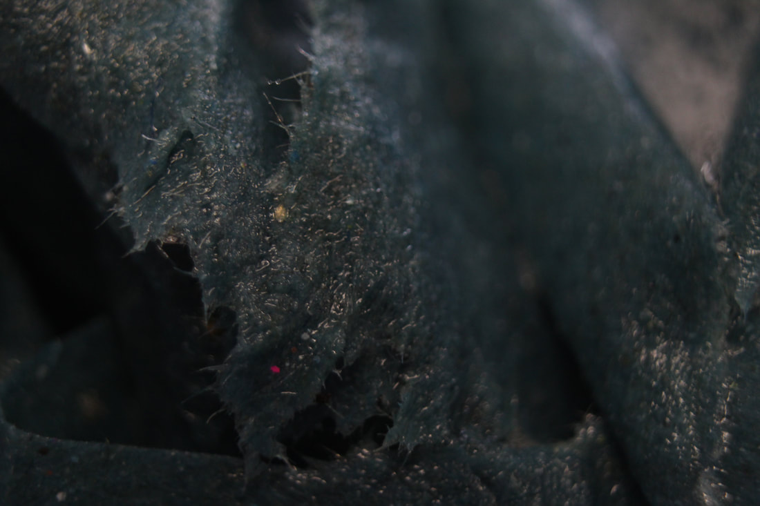
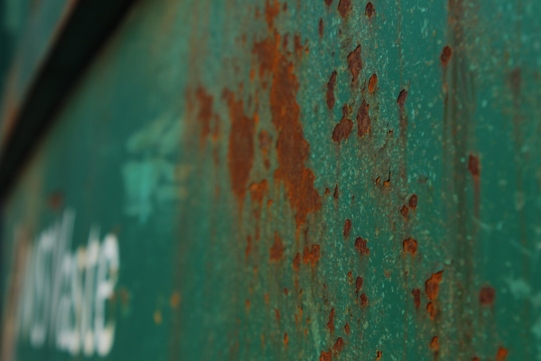
Man-made:


Worst Image:Highly out of focus, nano lens was not used correctly and exposure was too long and lighting was too strong therefore sense of perspective is lost. I could attempt this again but use something stable to hold the camera, such as a tripod.
|

Best Image:Correctly exposed, and shiny, focal point is used in the glare, created by lighting, of metal, very clear centre with a narrow depth of field creating an effective focal point.
|
Rust


Artificial Flowers and Fruit 1.0 :


Worst Image:Extremely out of focus not anything is visible except a plastic pineapple we can barely see. Aperture is too low and lens needs to be adjusted
|

Best Image:The former image is quite out of focus and has a lot of noise in comparison to the latter, which is actually framed and focused very clearly and coherently. The first one is framed very poorly due to the fact that it is not using the rule of thirds, it is only a central focal point so it has no variety, but the latter image has a focal point of the flower and the pot is assigned to the rule of thirds. Correctly exposed and aperture has been used to create a focal point.
|
Nature:


Worst Image:ISO extremely high, basically just a pitch black image so the shutter speed needs to be shortened and white balance needs to be adjusted.
|

Best Image:The colours of the red berry and green leaves fiercely contrast in this due their position on the colour wheel, drawing the readers eyes to it which creates the is the focal point : the berry. Narrow depth of field has been used to create an out of focus effect also helping the focal point.
I could adjust light balance for more coherent greens. |


Fruit 1.0


Worst Image:Extremely out of focus and framing is appalling, too much background aperture hasn't been used correctly and tomato is too far away, an F-4 would be ideal.
|

Best Image:Framing is perfect, good amount of background and shine on tomato with narrow depth of field has been used to create central focal point to draw viewers eyes to subject.
|
Shoot plan:
Description of aims for shoot:
Taking photos of seashells close up in a very abstract style, unusual angles to capture angles and grooves in shells
Links with Photographers:
Inspired by the photography style of Lucy Shires, takings images of old and rusty modern architecture.
Location: Props/ items needed: Kit needed:
In class, using tables on the sides with paper and a mirror for an interesting background similar to Westons backgounds.
Camera settings I will use:
High f-stop to create alot of clarity for the close ups. Indoors so I will have to use a fast shutter speed, something such as 1/125 should be ideal but adjust depending on lighting. Low iso such as 50 - 100 to keep the noisiness as low as possible, also using a tungsten or shadow white balance to stop the photograph from having a colour tinge.
Which compositional rules will I use?
Rule of thirds, close ups to capture texture, even numbers to create a sense of symmetry, worms eye view and rule of thirds.
Seashells:


Worst Image:Extremely out of focus due to long shutter speed and unsteady hand movement, over exposed also making it too bright and blurry.
|

Best Image:Background is similar to a dreamy, cloudy setting and the mirror has been used to create this effect, and its reflection adds another layer to the image.
The focal point is the shell but it is ever so slightly overexposed, which can be fixed by editing. White balance needs to change due to a blue tinge on of the images. |
Super Soaked:


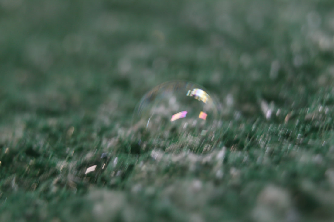


Worst image:Very under exposed and ISO too high, causing it to be out of focus and a image that's too dark.
|

Best Image:Slightly blurry to create a focal point that the glare on the bubble draws eyes to : the bubble on the sponge. The rule have even has been used as in the rule of evens.
|
Water Paint Effect Edit :
Original Image : |
Edited Image : |


Roe Etheridge Moodboard:


Shoot plan:
Description of aims for shoot:
Taking photos of fruits and vegetables to capture their textures and colours, quite close up with a shorter depth of field to create that focal point of the image, complimentary colours and spotlights used also.
Links with Photographers:
Inspired by the photography style of Roe Etheridge, takings images of fruit with animals incorporated.
Location: Props/ items needed:
In class Variety of fruit and veg (apples, pomegranate, sweetcorn ect…) Tripod and a spotlight, background paper ect.
Camera settings I will use:
Low f-stop such as F4-8 to create a slightly out of focus background and make the focal point the fruit we're capturing . We will be shooting indoors so I will have to use a fast shutter speed such as 1/125 should be ideal. Low iso to keep objects clean looking in photos
Which compositional rules will I use?
The rule of thirds should be used due to the fact that this has been applied in a lot of Etheriges images as it draws the readers on the photo for longer due to the different sections , but also a worms eye view and a birds eye view to resemble how animals nature would view it.
Cabbage


Worst Image:Too bright, lighting, ISO, and while balance needs to be adjusted as is is too bright and there is a little gap in the top that isnt very good.
|

Best Image:Very well use of aperture to create an out of focus effect, and white balance is being optimized in the studio lighting to amplify the green of the cabbage , however the other cabbage in the background would be better if removed and replaced.
|
Grapefruit


Worst image :
White balance or shutter speed is two high due to the peel of the orange being way too dark for it a nice photo due to the fact that the white balance was poorly chosen.
|

Best image :
Do this
|


Worst image :The lighting in this photo is absolutely appaling, as most of the pepper looks very dark due to this. Framing is also very poor as the rule of evens or the rule of thirds wasnt used.
|

Best image :
The framing and lighting of this picture has been used very well to exaggerate the texture of the corn and the little hairs on it. This image could be improved with some increased contrast as the yellow of the corn is quite dull.
|
Final Shoot :


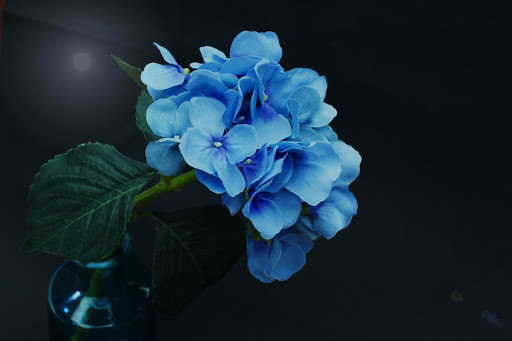
Best Image :The ISO is perfectly used here to create a blur around the flower, which makes the actual purple flower itself become the focal point, drawing the viewers eyes right towards the purple. Theres also a contrasting colour within the flower, with the dark and light purple bouncing off each other.
|

Worst Image :Extremely overexoposed and or the white balance was off, and it wouldve been preferable to use an automatic setting instead. The framing isnt great either as the sides of the basket arent in the photo and no rule of thirds or any other rules has really been applied.
|


Best Image:A good contrast of light to dark from the left and right. ISO is spot on as the sides are nicely out of focus to create a central focal point of the bottom of the cherry blossom that instantly draws the readers eyes, and complimentary colours (touches of red from the flowers and the green of the leaves) have also been used.
|
Worst Image:The framing is quite bad as the bird in the tree is far from the focal point and the rule of thirds nor evens has been applied ; and the picture is highly noisy, either due to ISO or the focus dial not being used effectively.
|
Edits


|
|


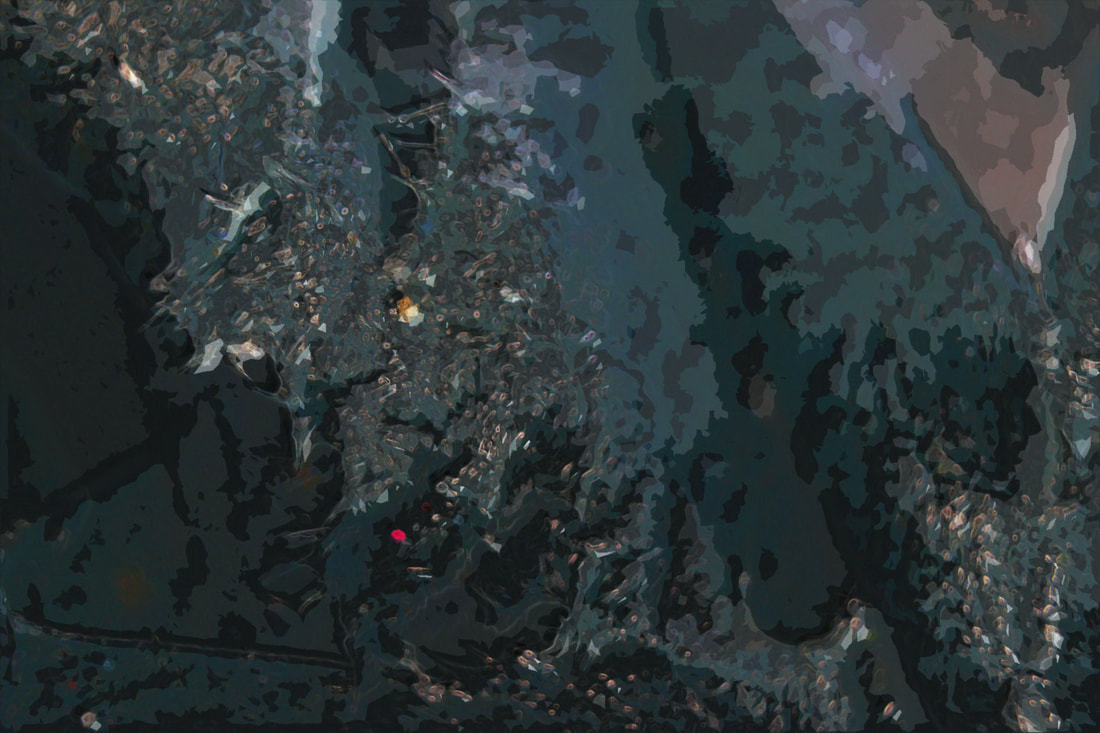
Editing Process :
This was just a simple colour enhancement through sharpened contrast and a small light glow on the sweet spot to create the feeling of a photo that would usually belong in something like a magazine or so, as its synthetic look achieves this effect.


Dreamy Rose Kaleidoscope Edit

Original Image |

Edited Image |
Editing Process


Edward Western Moodboard:


Shell Edit (in the style of Edward Western)
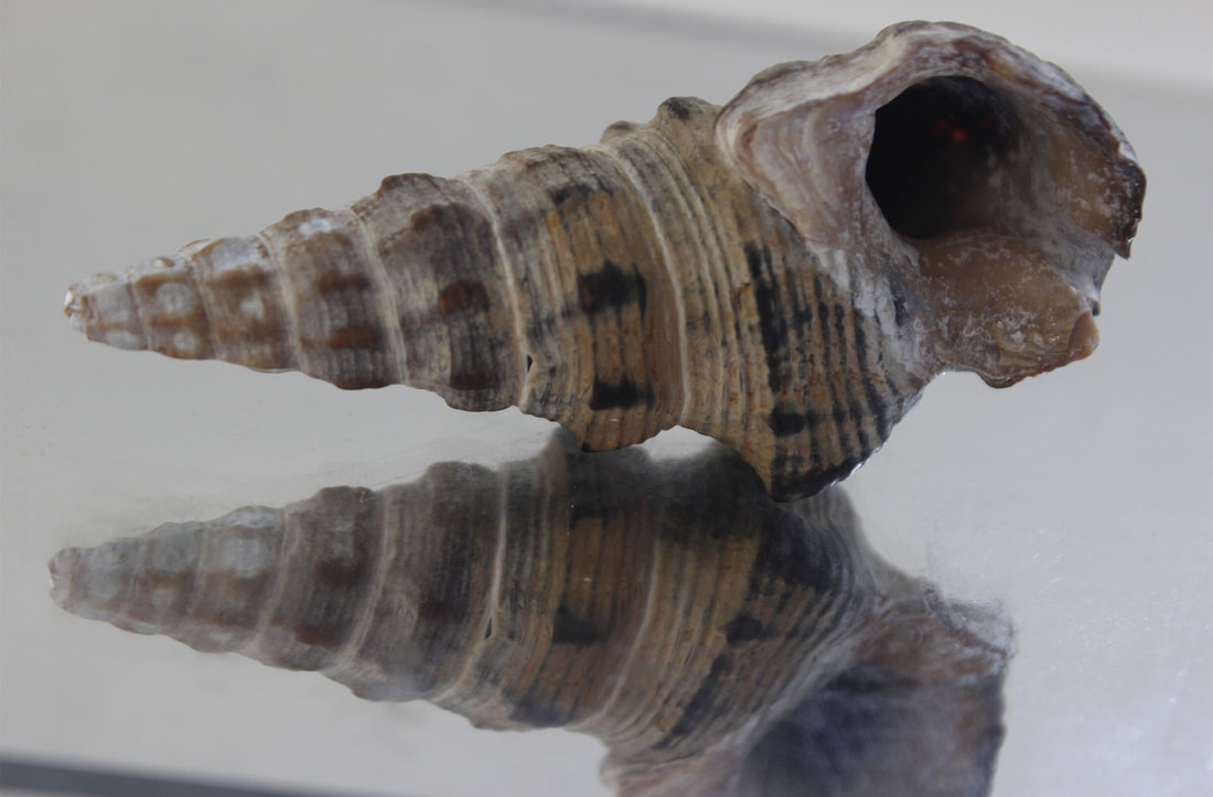
Original Image |
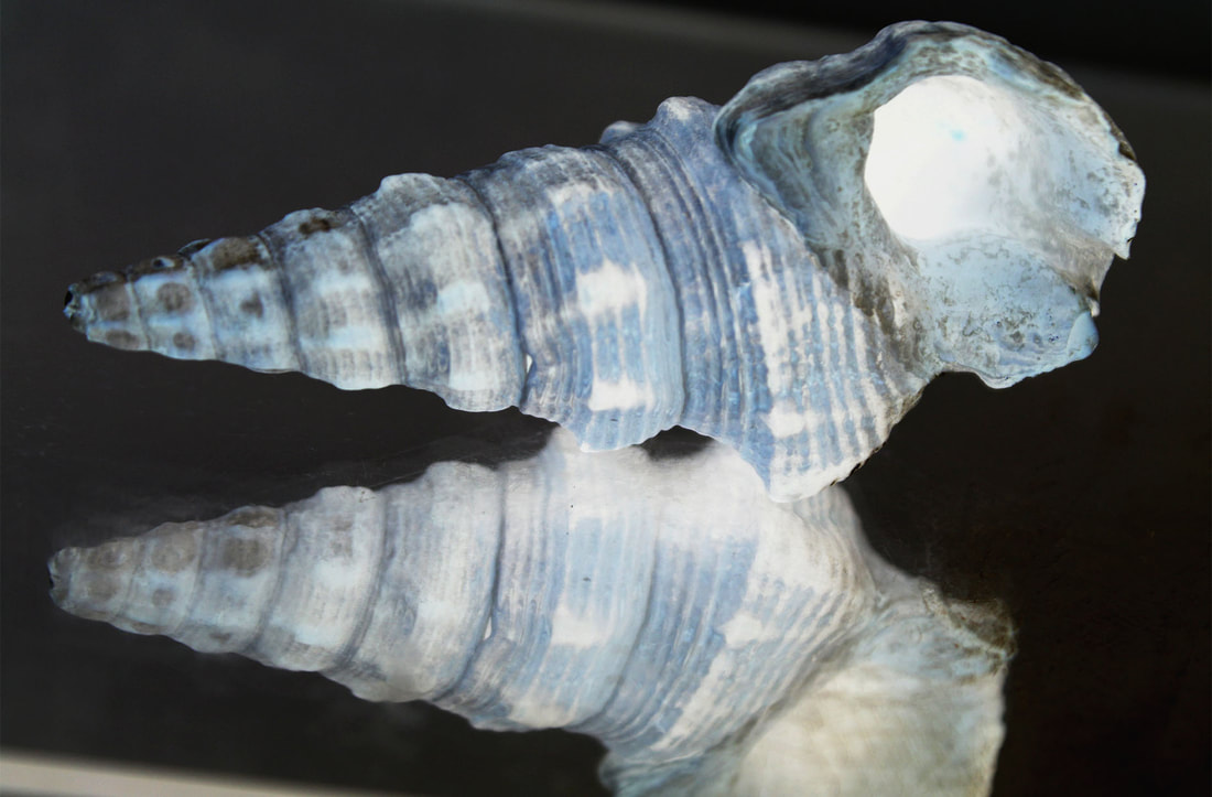
Edited Image |
Editing Process


Lettuce Kaleidoscope Edit

Original Photo: |
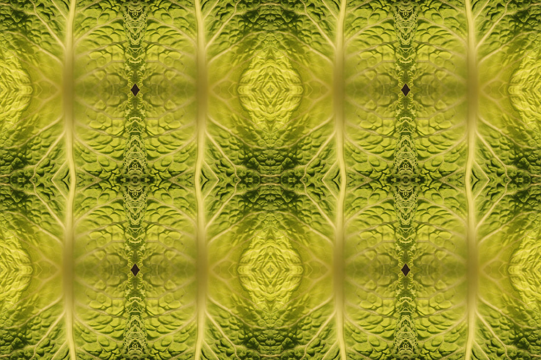
Edited Image : |
Editing Process :


Final Gallery
Evaluation
When I initially began this project I was limiting my range of styles to just natural textures, such as fruits and vegetables like sweetcorn and tomatoes, combined with a basic close up capture but then - mostly inspired by Lucy shires - I decided to experiment with more artificial, architectural and man-made textures like chipped walls, rusty metal ect... The addition of a macro lens enabled me to be able to take snapshots of different character in the texture that previously would have been unobservable. Using the newfound skills I had acquired while taking photos of man-made textured I then shifted back to natural textures, but this time in more outdoors environments, including flowers and trees.
My favourite section of this subject was most likely editing the already captured pictures as it allowed me to be as creative as possible. Editing my pictures either comprised of many different types ; one of my favourites being how I change the colour scheme of a photo completely, drawing out a wholly opposite atmosphere. The kaleidoscopes I've composed are also a favourite of mine as the end product and the starting piece appear and feel as if they’re divergent, despite the fact that they
both originate from the same photo which I find extremely compelling. Other than that I feel that for the best outcome, a lot of editing would be unnecessary, so the majority of my edits are colour enhancements, either in the famous style of Edward Western or my own abstract way, which are the results of experimentation.
